Garuda Indonesia UI Redesign Challenge
Client
GreatEdu
Duration
1 Week
Category
UI Design
DISCLAIMER!
This is part of the GreatEdu UI/UX Studi Independen Program. The design brief is based on one of my assignments: redesigning and creating a visual design from any real application. I am not working under contract with Garuda Indonesia Airlines.

INTRODUCTION
Hi!👋 I’m Albert Fernando, a college student at ITB STIKOM Bali. Currently, I’m attending the Studi Independen Program with GreatEdu. This case study is written to publish my work on “Visual Design,” which, in this case, analyzes which app needs to be improved on the experience and interface side. Also, to redesign those screens and create a clean visual design. I will also compare before and after the redesign I’ve already made.
OVERVIEW
Garuda Indonesia is a trusted airline and also part of the SkyTeam. Garuda Indonesia has also received the title of airline with the best cabin crew in the world several times, so there is no need to doubt the quality of the Garuda Indonesia airline. The ticket booking process is one way to sample the best airlines in the world, and one of them is through a mobile application. Improving the experience of using this mobile application is hoped to complement further the best experience for flying with Garuda Indonesia.


Design Brief:
Analyze the application that needs to be improved on the experience and interface side.
Redesign the application with a minimum of 7 screens that you’ve chosen.
Create a clean visual design.
Project Timeline:
23rd September 2023 — 28th September 2023

Roles & Responsibility:
UI designer — Create a clean visual design based on the research

APP SEARCHING PROCESS
I started to check several apps that need improvement based on experience or interface. But in my opinion, based on the several apps that I’ve found, some of them need to be improved on the back end (coding fix), not on the front end (design fix). I found Garuda Indonesia and think I can help improve on both sides (experience and interface).

REDESIGN RESEARCH LIST
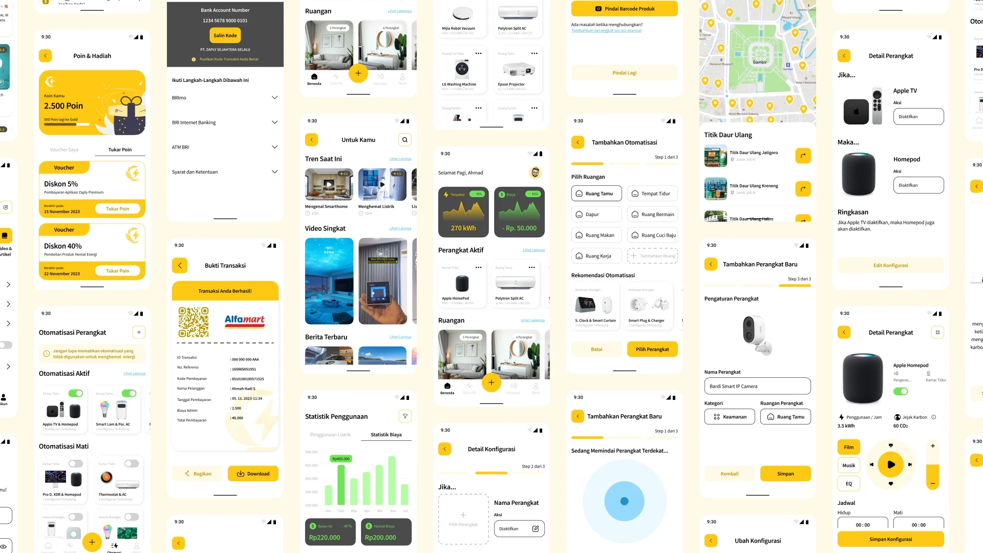
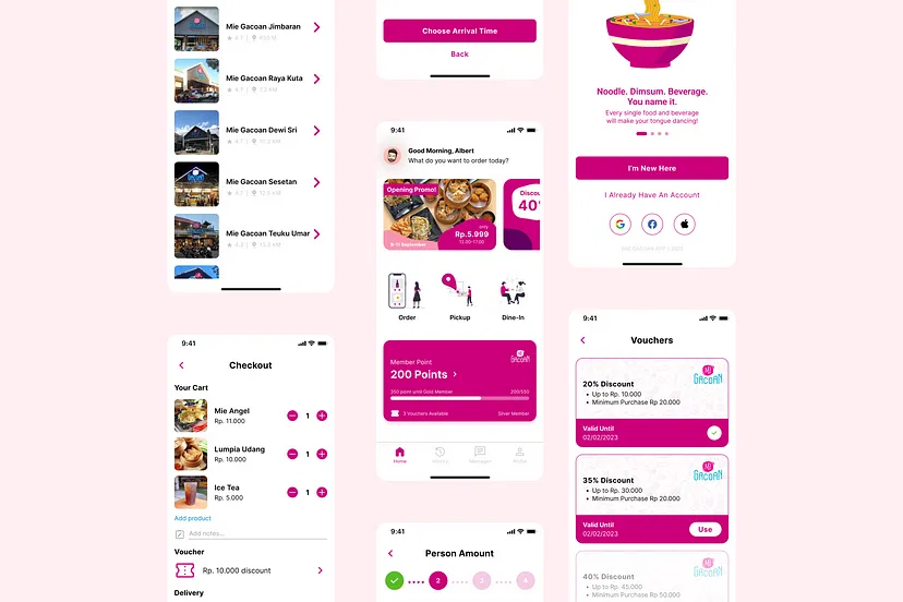
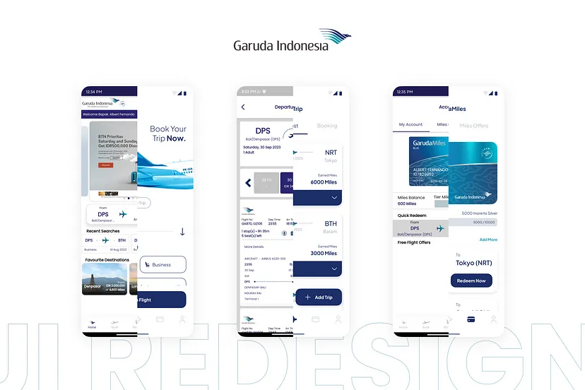
I took some time to try on the Garuda Indonesia Mobile App and found a list of the screens that need to be improved on the experience & interface side. I also added some screens that can complete the small prototype later on; those screens are:
Homescreen + booking
Ticket Selection + loading
GarudaMiles
Profile
Login & signup page
My Trip + empty state page
Trip summary page
Booking review page
Payment method page
Additional screen that I’ve added
I will show each of the screens and the explanation that I’ve made.

Homescreen + Booking Screen

2. Ticket Selection + Loading screen


3. GarudaMiles

4. Profile

5. Login & Signup Page


6. My Trip + Empty State Page

7. Trip Summary Page

8. Booking Review Page

9. Payment Method Page

10. Additional screen that I’ve added


You can try the mini-prototype too by click 👉here👈

Lesson learned:
Every design created must have been well-researched and implemented based on the analysis and research results.
No matter how good a design is, there will always be different points of view, and we have to take those different points of view to make our design even better.
There is no perfect design in this world!

Thank you for reading my case study to the end! I realize there are still shortcomings, and I await your feedback/suggestions! 😄 all kinds of input/suggestions can go directly to the comments column below; your input/suggestions will help me learn even better. I can’t wait to hear from you!
Please mail me at albert77533@gmail.com
Garuda Indonesia UI Redesign Challenge
Client
GreatEdu
Duration
1 Week
Category
UI Design
DISCLAIMER!
This is part of the GreatEdu UI/UX Studi Independen Program. The design brief is based on one of my assignments: redesigning and creating a visual design from any real application. I am not working under contract with Garuda Indonesia Airlines.
INTRODUCTION
Hi!👋 I’m Albert Fernando, a college student at ITB STIKOM Bali. Currently, I’m attending the Studi Independen Program with GreatEdu. This case study is written to publish my work on “Visual Design,” which, in this case, analyzes which app needs to be improved on the experience and interface side. Also, to redesign those screens and create a clean visual design. I will also compare before and after the redesign I’ve already made.
OVERVIEW
Garuda Indonesia is a trusted airline and also part of the SkyTeam. Garuda Indonesia has also received the title of airline with the best cabin crew in the world several times, so there is no need to doubt the quality of the Garuda Indonesia airline. The ticket booking process is one way to sample the best airlines in the world, and one of them is through a mobile application. Improving the experience of using this mobile application is hoped to complement further the best experience for flying with Garuda Indonesia.
Design Brief:
Analyze the application that needs to be improved on the experience and interface side.
Redesign the application with a minimum of 7 screens that you’ve chosen.
Create a clean visual design.
Project Timeline:
23rd September 2023 — 28th September 2023
Roles & Responsibility:
UI designer — Create a clean visual design based on the research
APP SEARCHING PROCESS
I started to check several apps that need improvement based on experience or interface. But in my opinion, based on the several apps that I’ve found, some of them need to be improved on the back end (coding fix), not on the front end (design fix). I found Garuda Indonesia and think I can help improve on both sides (experience and interface).
REDESIGN RESEARCH LIST
I took some time to try on the Garuda Indonesia Mobile App and found a list of the screens that need to be improved on the experience & interface side. I also added some screens that can complete the small prototype later on; those screens are:
Homescreen + booking
Ticket Selection + loading
GarudaMiles
Profile
Login & signup page
My Trip + empty state page
Trip summary page
Booking review page
Payment method page
Additional screen that I’ve added
I will show each of the screens and the explanation that I’ve made.
Homescreen + Booking Screen
2. Ticket Selection + Loading screen
3. GarudaMiles
4. Profile
5. Login & Signup Page
6. My Trip + Empty State Page
7. Trip Summary Page
8. Booking Review Page
9. Payment Method Page
10. Additional screen that I’ve added
You can try the mini-prototype too by click 👉here👈
Lesson learned:
Every design created must have been well-researched and implemented based on the analysis and research results.
No matter how good a design is, there will always be different points of view, and we have to take those different points of view to make our design even better.
There is no perfect design in this world!
Thank you for reading my case study to the end! I realize there are still shortcomings, and I await your feedback/suggestions! 😄 all kinds of input/suggestions can go directly to the comments column below; your input/suggestions will help me learn even better. I can’t wait to hear from you!
Please mail me at albert77533@gmail.com
Garuda Indonesia UI Redesign Challenge
GreatEdu
1 Week
UI Design
DISCLAIMER!
This is part of the GreatEdu UI/UX Studi Independen Program. The design brief is based on one of my assignments: redesigning and creating a visual design from any real application. I am not working under contract with Garuda Indonesia Airlines.
INTRODUCTION
Hi!👋 I’m Albert Fernando, a college student at ITB STIKOM Bali. Currently, I’m attending the Studi Independen Program with GreatEdu. This case study is written to publish my work on “Visual Design,” which, in this case, analyzes which app needs to be improved on the experience and interface side. Also, to redesign those screens and create a clean visual design. I will also compare before and after the redesign I’ve already made.
OVERVIEW
Garuda Indonesia is a trusted airline and also part of the SkyTeam. Garuda Indonesia has also received the title of airline with the best cabin crew in the world several times, so there is no need to doubt the quality of the Garuda Indonesia airline. The ticket booking process is one way to sample the best airlines in the world, and one of them is through a mobile application. Improving the experience of using this mobile application is hoped to complement further the best experience for flying with Garuda Indonesia.
Design Brief:
Analyze the application that needs to be improved on the experience and interface side.
Redesign the application with a minimum of 7 screens that you’ve chosen.
Create a clean visual design.
Project Timeline:
23rd September 2023 — 28th September 2023
Roles & Responsibility:
UI designer — Create a clean visual design based on the research
APP SEARCHING PROCESS
I started to check several apps that need improvement based on experience or interface. But in my opinion, based on the several apps that I’ve found, some of them need to be improved on the back end (coding fix), not on the front end (design fix). I found Garuda Indonesia and think I can help improve on both sides (experience and interface).
REDESIGN RESEARCH LIST
I took some time to try on the Garuda Indonesia Mobile App and found a list of the screens that need to be improved on the experience & interface side. I also added some screens that can complete the small prototype later on; those screens are:
Homescreen + booking
Ticket Selection + loading
GarudaMiles
Profile
Login & signup page
My Trip + empty state page
Trip summary page
Booking review page
Payment method page
Additional screen that I’ve added
I will show each of the screens and the explanation that I’ve made.
Homescreen + Booking Screen
2. Ticket Selection + Loading screen
3. GarudaMiles
4. Profile
5. Login & Signup Page
6. My Trip + Empty State Page
7. Trip Summary Page
8. Booking Review Page
9. Payment Method Page
10. Additional screen that I’ve added
You can try the mini-prototype too by click 👉here👈
Lesson learned:
Every design created must have been well-researched and implemented based on the analysis and research results.
No matter how good a design is, there will always be different points of view, and we have to take those different points of view to make our design even better.
There is no perfect design in this world!
Thank you for reading my case study to the end! I realize there are still shortcomings, and I await your feedback/suggestions! 😄 all kinds of input/suggestions can go directly to the comments column below; your input/suggestions will help me learn even better. I can’t wait to hear from you!
Please mail me at albert77533@gmail.com
Garuda Indonesia UI Redesign Challenge
Client
GreatEdu
Duration
1 Week
Category
UI Design
DISCLAIMER!
This is part of the GreatEdu UI/UX Studi Independen Program. The design brief is based on one of my assignments: redesigning and creating a visual design from any real application. I am not working under contract with Garuda Indonesia Airlines.
INTRODUCTION
Hi!👋 I’m Albert Fernando, a college student at ITB STIKOM Bali. Currently, I’m attending the Studi Independen Program with GreatEdu. This case study is written to publish my work on “Visual Design,” which, in this case, analyzes which app needs to be improved on the experience and interface side. Also, to redesign those screens and create a clean visual design. I will also compare before and after the redesign I’ve already made.
OVERVIEW
Garuda Indonesia is a trusted airline and also part of the SkyTeam. Garuda Indonesia has also received the title of airline with the best cabin crew in the world several times, so there is no need to doubt the quality of the Garuda Indonesia airline. The ticket booking process is one way to sample the best airlines in the world, and one of them is through a mobile application. Improving the experience of using this mobile application is hoped to complement further the best experience for flying with Garuda Indonesia.
Design Brief:
Analyze the application that needs to be improved on the experience and interface side.
Redesign the application with a minimum of 7 screens that you’ve chosen.
Create a clean visual design.
Project Timeline:
23rd September 2023 — 28th September 2023
Roles & Responsibility:
UI designer — Create a clean visual design based on the research
APP SEARCHING PROCESS
I started to check several apps that need improvement based on experience or interface. But in my opinion, based on the several apps that I’ve found, some of them need to be improved on the back end (coding fix), not on the front end (design fix). I found Garuda Indonesia and think I can help improve on both sides (experience and interface).
REDESIGN RESEARCH LIST
I took some time to try on the Garuda Indonesia Mobile App and found a list of the screens that need to be improved on the experience & interface side. I also added some screens that can complete the small prototype later on; those screens are:
Homescreen + booking
Ticket Selection + loading
GarudaMiles
Profile
Login & signup page
My Trip + empty state page
Trip summary page
Booking review page
Payment method page
Additional screen that I’ve added
I will show each of the screens and the explanation that I’ve made.
Homescreen + Booking Screen
2. Ticket Selection + Loading screen
3. GarudaMiles
4. Profile
5. Login & Signup Page
6. My Trip + Empty State Page
7. Trip Summary Page
8. Booking Review Page
9. Payment Method Page
10. Additional screen that I’ve added
You can try the mini-prototype too by click 👉here👈
Lesson learned:
Every design created must have been well-researched and implemented based on the analysis and research results.
No matter how good a design is, there will always be different points of view, and we have to take those different points of view to make our design even better.
There is no perfect design in this world!
Thank you for reading my case study to the end! I realize there are still shortcomings, and I await your feedback/suggestions! 😄 all kinds of input/suggestions can go directly to the comments column below; your input/suggestions will help me learn even better. I can’t wait to hear from you!
Please mail me at albert77533@gmail.com